The importance of the new public beta - a photographer’s perspective
For fotografer, photoshop represent its darkroom of photography. With photoshop, a fotografer can edit result of its photos. Adobe photoshop launch newest version that is adobe photoshop CS3. Following appearance of photoshop CS3 from photographer's perspective by Mark Galer. Or visit on site photoshopsupport.
Many photographers who have tried to run Bridge and CS2 using a Mac laptop have found that it can be a painfully slow process. It usually requires that they run only one of the applications at any one time - which sort of defeats the purpose of the Bridge/Photoshop relationship. For many photographers the need to shoot and manage memory intensive RAW files has only added to the burden. Adobe has not been deaf to this pain and has released this public beta to ease/erase the pain for this part of the Photoshop community. PC owners have not been left out in the cold this Christmas, and will also get to enjoy the new features ahead of time as well.
A known bug - brush-size for MacIntel users
The Photoshop CS3 Beta can run on a Mac using a G4 or G5 processor or on a new Mac using the new Intel Core Duo processor. Applications that have not yet been updated to run on a Mac using the new Intel processors run under an emulation mode called ‘Rosetta’. If you are using Photoshop CS2 on a new Mac you are currently opening the software using Rosetta. New applications that have been designed to run on the new Intel processors are said to run ‘natively’, i.e. they don’t need to open using the Rosetta emulation mode. This is where the Mac user gets the speed increase they have been waiting for.
I am currently running Bridge natively on my Mac Book (using the new speed advantage of the Intel processor). I am however choosing to run Photoshop CS3 in emulation mode (Rosetta). I have opened up the ‘Info’ window for the Photoshop CS3 application file, and have checked the box that says ‘Open using Rosetta’. I have had to do this due to the fact that the brush-size cursor is not currently working in the Photoshop CS3 beta, for the Mac user running the application natively (you only get a cross hair no matter what the size of your brush is). If you don’t paint then you can take full advantage of the speed of the new processor, and run Photoshop CS3 natively. If like me however brushing is a major part of your photo-editing work then you will also need to consider running Photoshop CS3 using Rosetta.
Lets put ‘the need for speed’ aspect aside for a moment and look at one of the most popular questions I usually hear around the release of a new version of Photoshop (even if this is not strictly the release time, and the beta version you will be downloading now is not the version that will go on sale next year).
“Does this new version of Photoshop represent a major or a minor upgrade?”
Professional photographers, believe it or not, don’t always upgrade every time there is a new version of Photoshop. Adobe, of course, say that all versions of Photoshop have been important revisions in the history of the software, as they don’t ‘slack off’ during any single developmental period. There are versions, however, when the feature set that is implemented has a significant effect on the photographer’s workflow. In this current climate of change, where implementing and managing an effective digital workflow is critical to the success of a commercial photographer, this new release does indeed represent a significant step forward for photographers. Although a lot of the new features in this release can be found in other applications, what is significant for this release is the way that Adobe has integrated them into a single software package and created a more effective workflow.
Photo Downloader
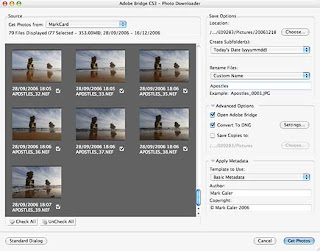
We have many new features, and a new interface with the public beta of Photoshop CS3 but which are the features that will have a significant impact on my own workflow? As a Mac laptop-wielding photographer, often working on location, the first thing to a have a significant impact on my workflow would have to be the new Photo Downloader. This downloader has made an appearance in the public beta of Photoshop Lightroom and in Photoshop Elements for PC users, but has only now made an appearance in Bridge.

This dialog box (that can be trained to self launch as soon as it detects a memory card) can now import the images directly into Bridge. Not only can we import the images straight into Bridge but we can also rename, convert to DNG, save copies to an external drive, sort into sub-folders and embed copyright info all at the time of import. If you have been using Bridge 1.0 to perform these tasks individually you will immediately recognize that this feature is a big time-saver for those photographers who are handling and processing hundreds of images on a daily basis.
Bridge CS3

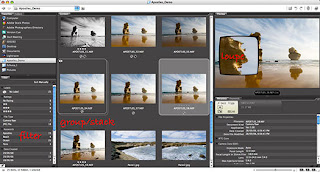
Once the sorting and ranking of images is underway photographers can now filter the images not only by rank, but also by numerous other differences such as file type, file orientation, format etc. After picking favorites the photographer can then group (or stack) similar images with the preferred thumbnail on top and the lower ranked images stacked behind the favorite image. This is a great way to start reducing the visual clutter in a folder of images and make the hero images more prominent in the folder. In my opinion this newly improved workflow is worth the upgrade itself.
Adobe Camera RAW 4.0 (ACR 4)
Once an image is open in the new Adobe Camera RAW 4.0 photographers will very quickly appreciate and grow to love the new Recovery and Fill Light sliders. These sliders (that first saw the light of day in Photoshop Lightroom) allow the photographer to very quickly increase the exposure in underexposed shadows and recover highlight information that may otherwise become clipped.
The extended dynamic range of the RAW format is probably THE biggest reason that many professional photographers now choose to shoot in the RAW format. Having a single slider called Recovery (rather than having to juggle the Exposure and Brightness sliders) will be a major time saving feature in the new CS3 workflow. There are many other new sliders in ACR 4 interface that allow the photographer to manipulate tonality and color in new ways before an image is opened in Photoshop or batch processed. Black and White conversions are now much more controllable in the ACR space and the overall improvements can only get better and better before ACR 4 is finally released next year (you have to keep reminding yourself that what you see now, is only work-in-progress).
New User Interface (UI)
The new UI may disturb or annoy some Photoshop users at first as they realize they will have to navigate their way around a new working environment. It’s about as inconvenient as buying a new camera and then hunting for the location of all the usual buttons – that are now in slightly different places.

I have to admit that I was not an instant convert to the new workspace, but now that I have been working with it for some time I find that I have more space dedicated to the image that I am editing, and I have learnt to work smart. I have finally realized the new UI can be organized so that it works smart, and not get in the way of my editing workflow. Once you get comfortable with this new environment and spend some time organizing the space to meet your own needs you will not want to go back.
The new features inside CS3 are a mixed bag - not all users will use all of the new features, but I have to say that just the speed and efficiency of Bridge CS3 and ACR 4 makes running the beta now, on a daily basis, a very tempting proposition.
The significant new and changed features in the Photoshop CS3 editing space include:
1. Auto-Align Layers and Auto-Blend Layers (NEW)
The greatly improved Photomerge feature utilizes the combined features of the new ‘Auto-Align Layers’ and ‘Auto-Blend Layers’ that can now be activated independently from the Edit menu. Photomerge was never really up to the task of creating seamless stitches – even if the auto exposure and auto white balance were turned off in the camera before capturing the component images.
2. Brightness/Contrast (IMPROVED)
This is probably a minor revision for experienced Photoshop users and will probably not affect many photographers who have been educated not to use this adjustment feature due to its destructive nature. The destructive nature has now, with Photoshop CS3, been turned off by default.
The Brightness Contrast sliders now operate in the same way as the sliders, that bear the same name in the Camera RAW dialog box. When the brightness slider is moved higher the gamma, or midtone, values in the image are made brighter, without clipping the highlight tones, and without rendering the darkest shadows tones too light. When the Contrast is increased in this dialog box it is now similar to creating an ‘S’ curve in the Curves dialog box, without moving the white and black points within the image.
For lovers of the old destructive nature (there is probably a few out there) the user can simply click on the ‘Use Legacy’ check box. For new users of Photoshop the new non-destructive nature of this adjustment feature will be of enormous benefit, until they graduate to the Levels and Curves adjustment features.
3. Curves (IMPROVED)
The Curves dialog box offers a significant improvement. The user can now see the histogram and check tonal clipping within this dialog box. This allows the photographer to bypass the Levels dialog box altogether if they so wish and simply set the black point and white point within the Curves dialog box before proceeding to manipulate the tonality and color by adjusting the curves.
The changes to each of the component channels can now be viewed in the master RGB view, and the changes can be saved as a custom preset that can be accessed from within the dialog box, rather than being saved and loaded to and from a remote location.
4. Device Central (NEW)
If you need to prepare visual information for a mobile device this new feature may be of interest to you. If you don’t you will probably never have a reason to go here.
5. Black & White (NEW)
This new adjustment feature (also available as an adjustment layer) is probably the easiest and most versatile way to convert images to Black & White. No more juggling sliders in Channel Mixer to prevent clipping and no clever techniques (such as Russel Brown’s dual Hue/Saturation layers technique) to implement this process.
The adjustment feature is a breeze to use and very versatile. You can use the color sliders if you like or simply click on a color within the image window and drag to the right to make lighter or to the left to make darker. How easy is that!
6. Smart Filters (NEW)
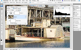
For those who learnt to love the non-destructive nature of Smart Objects (perhaps just a small minority at this point in time) then you will simply love the fact that we can now filter these Smart Objects in a non-destructive way in CS3. You can apply a filter to a layer and then change the filter values further down the track, without having to revert to the original file or create another background copy layer. This will be particularly useful for sharpening images for print.
If you convert the layer to a smart object before applying the Unsharp Mask, or Smart Sharpen filter, it will simply be a matter of double clicking the filter component of the layer to re-open the filter dialog box, and change the settings to more appropriate values, if the output device or medium ever changes. For advanced editors this will open a whole new way to edit and re-edit images. RAW images could be opened as Smart Objects in CS2 but now that we can filter these layers with Smart Filters the era of a totally non-destructive editing workflow is about to dawn for many users.
7. Quick Selection and Refine Edge (NEW)
The tragic wand suddenly doesn’t look remotely magic anymore. This is an intelligent wand that adapts its tolerance as it moves around your image. For the casual Photoshop user this may represent a significant new tool in your workflow. For the advanced user who creates selections with graphics tablets, via channels or with the Pen Tool I suspect that this tool will fail to impress, or indeed change the way you currently make your selections. Similarly the Refine Edge tool is a quantum leap forward from the Modify commands in the Select menu.
The Refine Edge dialog box offers visual feedback when you refine the quality of the edge selection so that your retouching or montage work is undetectable. For Advanced users who use a Levels adjustment on their layer masks to refine edge quality (a technique outlined in the Photoshop CS2: Essential Skills book) I suspect that the Refine Edge dialog box will gather cobwebs along with the Dodge and Burn Tools.
8. Clone Source and ‘Ignore adjustment layers’ option (NEW)
This new palette may help many who use either the Clone Stamp Tool or the Healing Brush Tool in their daily workflow. After Option clicking (Mac) or Alt clicking (PC) to set the source of the pixels we can now see an overlay of these pixels at a reduced opacity as we move over the part of the image that we want to adjust or modify. I personally will be still using my Super Stamp technique that I highlighted in one of my recent podcasts, where the Stamp Tool within Vanishing Point is used to clone pixels, rather than the Clone Stamp Tool in the main editing space.
This new clone source palette will not replace the technique I currently use, as the Clone Stamp Tool within the current public beta still has no option to ‘heal’. For many users the myriad of options to set multiple clone points, scale and rotate the cloned pixels, set blend modes for the overlay at reduced opacity, together with the visual confusion of seeing two versions of your image at different opacities, may well limit the number of Photoshop users who are prepared to use this palette.
9. Vanishing Point (IMPROVED)
I was very impressed with this feature when it arrived with CS2, but 18 months later I can count the number of images I have needed to edit in perspective on one hand. I have belatedly realized that its primary strength is for overlaying two-dimensional images, or graphics over images that contain regular and very accurate planes of perspective, e.g. a label over a box.
I saw the demo movies about moving a window onto another wall of the building and was inspired to create surrealistic cityscapes. The reality however is that you can’t move windows, doors or any other object that was photographed at a specific distance from your lens, further back or further forward, along the plane of perspective as the angle of view to this object then appears unrealistic. I also found that you have to be incredibly lucky to be able to retouch a surface as it recedes into the distance, with texture or detail taken from the foreground. Usually the inaccuracies of any repeating pattern or inconsistencies of ambient light preclude this editing technique. The newly improved Vanishing Point cannot hope to make any advances in this department, but what it can now do (I didn’t know it couldn’t do it in CS2 as I am not a graphic designer, or into product packaging) is create additional planes that are not 90 degrees to the original plane or surface created.
Conclusion
Photomerge, Curves, Black & White and Smart Filters are the new features that will impact most on my own workflow. These features herald increased efficiency and flexibility. Together with Bridge and ACR 4.0, I would have to rate this as a significant new version of Photoshop. It is perhaps feasible to imagine living without any of the new tools and techniques on offer in Photoshop CS3 beta release, but if you have been working on Location with a G4 PowerBook and now own a MacBook or MacBook Pro the speed of this beta alone will win you over. And that my friends, is the only reason we have this beta release in the first place.


No comments:
Post a Comment